
There are fonts out there that pretend to look like chalkboard writing, but when it comes down to it, they just don't. In this Photoshop tutorial you'll learn how to create a realistic looking chalkboard text effect that's simple to do. Off we go...
Step 1: Get yourself a nice chalkboard image where your text (or image) will go. I've picked the one below. The higher resolution the better, especially if you're printing. Shoot for 300 DPI in that case to get a photo-realistic chalk effect.
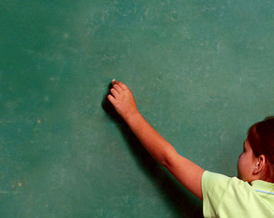
Click to enlarge
Step 2: Download the free font Kindergarten, or use some other scripty looking font that you have gathering dust. Remember, to install a font on a Windows machine, you can just go to your control panel, select "Fonts", and drag the font into the folder.
Step 3: With your chalkboard image open, select the text tool ("T"). Make sure the font you want is selected and type your text in a very slightly greyed tone.

Step 4: Now, duplicate your text layer by dragging and dropping it to the new layer icon in the Layers panel (shown below).
Step 5: Right-click the bottom text layer and hit "Rasterize Layer". Double-click this rasterized text layer to bring up the effects menu. (It helps if you hide the top text layer from view by clicking on the eye icon in the layers panel).
Step 6: With the effects panel up on this rasterized layer, click "Stroke" and set a 1 pixel, outside stroke in the same color as the chalkboard text. Set the blend mode to "Dissolve", and the opacity to 30%. You should get something that looks like this:
Step 7: Click "Pattern" and set the blend mode to "Dissolve". Almost any pattern will do. Play with the settings until you get something like this:

Step 7: Now go to Layer > Layer style > Create layer. This will turn separate the effects layer from the type layer. Link the two in the layers panel, then click the little arrow in the upper right corner of the layers panel and select "Merge linked".
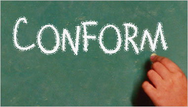
Step 8: Your "fuzzy" layer should look just like it did in step 6. Go to Filter > Gaussian blur and blur it will a radius of about 0.3 pixels or so. Make the top text layer visible (that you duplicated in step 4), make sure it's above the layer you've been working with, and set its blend mode to "Soft light". You should have something that looks like this:

Click to enlarge
There you have it. Once you've got the steps down this effect is pretty quick to recreate. Mess around with the smudge and soften tools to make the text look as if it was touched when writing it. Hope this tutorial's useful to you.
Read more: http://www.webdesign.org/photoshop/text-effects/realistic-chalk-font-text.10339.html#ixzz1xIKM3gVL
title says gimp, tutorial is for photoshop.
ReplyDeleteshame on you